
Cursus Pingo
Latin: The Process of Painting

A few months ago I came up with a 3-Value range for colours. These sets of colours can theoretically give enough depth to any art. I've been perfecting these palettes of colours for a long while now, and I'd like to explain why.
Do you know the first comment almost anyone says when they first see NIKRA?
"It LOOKS like Minecraft/Terraria"
Do you know the first comment almost anyone says when they first see NIKRA?
"It LOOKS like Minecraft/Terraria"
*keyword LOOKS*
I'd normally have to explain: "I guess so, but the gameplay is different" blah blah blah
To be honest, I think NIKRA looks like those games too. And it hurts me.
I made NIKRA's textures almost a year ago now. In that time I've done so much, and gotten so much better at art and design. I've spent a while playing around in blender, perfecting colour composition in three dimensions. And now, I believe I have it. I believe THIS is the right thing to do.
I'm going to use my Cursus Pingo Theory for NIKRA
I'd like to present to you, the concepts and styles for the NIKRA I have envisioned:
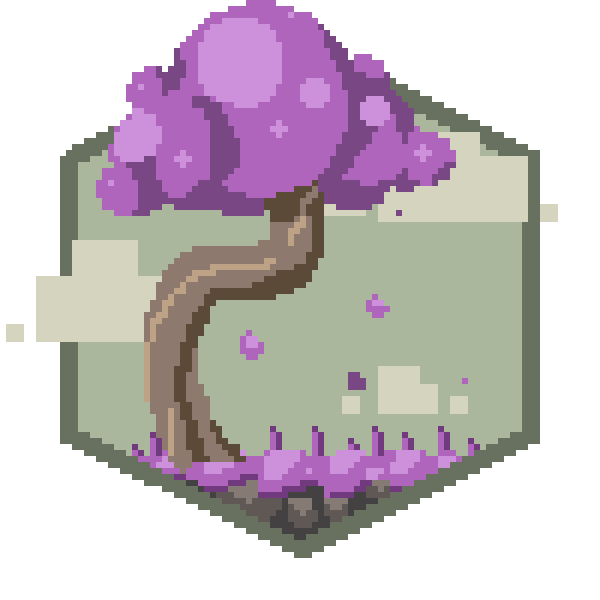


What do you think? Is this a definite improvement?
Now, obviously this style will be translated into tiles. But you should get the idea.
I know the feeling of change sucks. But I believe this is best. (and should make it stand out in the market!)
Thanks everyone for your support!
~Seth
I know the feeling of change sucks. But I believe this is best. (and should make it stand out in the market!)
Thanks everyone for your support!
~Seth
Now it looks like Starbound instead!
ReplyDeleteJust stop it. :|
DeleteHahaha, but Starbound looks like Terraria ;P
DeleteIt indeed looks better and more unique than the screens on deviantART!
ReplyDeleteI think that it looks great! I think that the difference in colours is a great idea. One tip though don't get to drastic as you don't want to have too much purple and blues and greens and then people say that it will look like FEZ. I think that the game looks great keep up the great work.
ReplyDeleteThat looks real good Seth.
ReplyDeleteI like the last picture with the tree and the picture of the floating island/rock thing with the pole(I forget it's name) on it.
I can wait to see the art get translated into tiles.
This is great! its one of my favorite styles for sure.
ReplyDeleteI think that the difference in colours is a great idea. One tip though don't get to drastic as you don't want to have too much purple and blues and greens and then people say that it will look like FEZ.
ReplyDelete